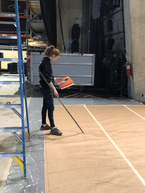
Alyssa drawing on pounce.
Q&A with Scenic Design Team for The Royale
Edited by Mariana Seda
Tell us who you are, what you do for the theatre department, and what your role with this production is.
Alyssa Thompson: I am a third-year scenic design student in the MFA program. I am the scenic designer for The Royale and work as a painter in the paint shop.
My job is to design the production. I work with the director and the team to come up with what kind of world we’re trying to create. I draft all of the scenery from an aesthetic standpoint. So, I say, “This is what I want it to look like. I want these pieces, this size, I want them to have this paint treatment,” and I hand those over. The technical director is the one who makes sure everything is structurally sound and built in a way that is safe and accurate. And then the scenic charge is the one who does all the finish work to actually make it look like the textures I designed.
Will Sexton: I am a second-year scenic design MFA candidate. I also have an assistantship in the paint shop. I’m scenic charge for The Royale, and scenic designer for next year’s Rent and I Wish.
The scenic charge works together with the scenic designer and scenic tech in maintaining the artistic vision of the show. I work with the designer to recreate the paint techniques on a larger scale. And I work with the technical director to collaborate when the set pieces will be done, when to prepare them for paint, and when we can have them ready. It’s coordination and collaboration of painting the show, creating the techniques, running the team and making sure it really comes to life and together with those extra details.
How did this play, the story of Jack Johnson, inspire your design?
AT: The script is very powerful. It is based on a real event, a boxing match. It’s a fictionalized retelling of it–but the fight was real. I was fascinated by Jack Johnson’s story. He was the first black heavyweight champion in boxing. And he really had to fight outside the ring to get that title. He was known to be an incredible athlete, but people didn’t want him to fight the current heavyweight champion, a white man, because of the stigma and the societal pressure around race in that era. I was really moved by this story and by that character, especially as I researched more about Johnson’s life, the ways he defied societal expectations at the time, and really became an antiracist figure.
Another part of his story is that after this fight happened, it was one of the first times a fight was filmed. It was in 1910, so film was very new. And the film of the fight was banned [because of racial tensions]. So, there’s that piece of censorship and the lack of representation. The production’s director, Tyrone Phillips, and I really wanted to honor Jack and give him his place in history. So, the idea for the design became creating a living monument to Jack Johnson. A lot of my inspiration came from monumental architecture.

Alyssa drawing on pounce.

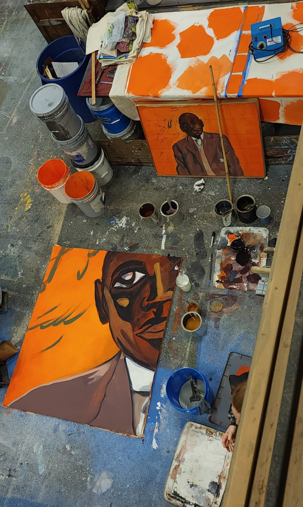
Painting Drop Sample
more questions
What drew you to Nikko Washington’s work and why did you decide to reach out for a collaboration?
AT: I did a lot of research into the big fight itself and what that looked like, as well as Jack Johnson and his background. But, I also specifically wanted to research black artists. This is a show about racism and representation, so it calls for black voices to be part of that conversation. I found this portrait of Jack Johnson that Nikko painted, so I started looking into his work. I found he had a lot of other paintings of black athletes and specifically in boxing because he himself is a trained martial artist.
I found this painting called “The Fighter is Absent,” and this is the one that really drew me because you have this silhouetted figure that’s being grabbed by all these hands. And he is like the main figure of the painting, but he’s not actually there. And I really felt that captured the essence of what is happening in the show of Jack Johnson having to fight all of these forces outside the ring in order to even be recognized as the champion of this sport. So, it’s really not even about the fight that’s happening inside the ring. It’s about everything he’s had to do to get to this moment to even be allowed to compete.
The serendipity of it is that we showed these [paintings] in our preliminary design meeting and Tyrone was like “How do you know about Nikko Washington? I love Nikko’s work.”
It just made sense to reach out to him to see if he had any interest in collaborating. We told him we were inspired by his work and wanted to create this monument to Jack Johnson, and we’d be interested in using a piece of his art. He was super excited about it and agreed to come onboard.

Painting Drop Sample

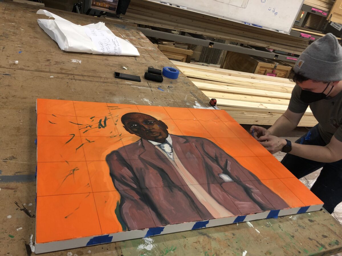
Will gridding painting with thread
final questions
Explain the idea and process behind taking Washington’s painting and transferring it onto a giant backdrop. How do you even begin a project like that? And what considerations went into maintaining the integrity of an artist’s work?
AT: The pieces that inspired us are currently in the Kavi Gupta Gallery in Chicago. So they were not available to us. Nikko was really excited about the idea of creating a new piece, so we ended up commissioning a new work. We had some meetings with him and the team to talk about what it might look like. He shared with us some initial research and color palette, so we all got to have a little bit of input on what that final piece was. Then he painted the piece at a smaller scale, and we scaled it up in the shop. And that’s where Will’s role comes in.
WS: It went from a 30 x 40 inch scale oil painting to a 15 x 20 feet backdrop. Anytime we get any type of paint elevation, which is what we call this ‘scaling up’ process, we do our best to honor the designer’s intent. In the case with Nikko’s painting, we wanted to replicate it exactly down to the oil brushstrokes and movement. That was very new to us. We work with acrylic paint, and it doesn’t work the same as oil paint–it dries much quicker so you can’t manipulate it the same way. So, we had to be very careful.
When we received his painting, the first thing we wanted to do was protect it. I mean, his paintings sell for thousands of dollars, so this is the most expensive paint elevation that we’ve ever worked with.
AT: It was this precious baby!
WS: Because we were working around it, we needed to reference it but didn’t want to get paint on it. So, we created our own protective case for it. Then we needed to grid it out–which usually means drawing on the piece. Obviously, we couldn’t do that with this original painting, so we cut some string and taped out a grid. Then we referenced that grid as we replicated it square by square, keeping it all relatively in perspective to each other, but on this larger scale. Once we had that outline, we started to paint. This step comes with experience and technique: you look at it, you analyze what the process is, and you work back to front, starting with base layers and moving into more details like shadow and highlights.
That sounds fascinating and complicated. What were some of the challenges you came across?
WS: I’ll admit the face was very intimidating. Alyssa did a really great job on that part. Working on humans is something that we really haven’t done before either–sculpting a human body like that at such a large scale with so much detail. So we had to sample it prior to going into this, so we’re not making the mistakes on the real flat when we go to do it. We’re figuring out if the colors work in relation to each other, if, in replicating the oil painting technique, we are doing justice to the work.
AT: This artist created this for us. So every brushstroke every line is important to the feeling and the style of his work. It was very different from ‘we’re taking this photograph and just sketching it out.’ We have to capture every mistake, every human error–when he lifted his brush here and, oh, this paint blended into that paint a little bit–is part of the character of that piece.
Nikko is super laid back and so great to work with. Every time we sent him a picture of our progress, we’d get fire emojis back or comments like, “It looks incredible.” He was very supportive and very excited to be a part of the process!
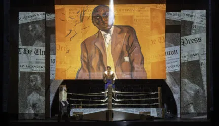
The full 15 x 20 foot backdrop painting of Jack Johnson is currently available for viewing as part of an exhibit at the Siebel Center for Design. There will be a reception and celebration of the work and collaboration on Friday, April 28, from 4:00pm – 6:00 pm.

Will gridding painting with thread

The Final Backdrop
